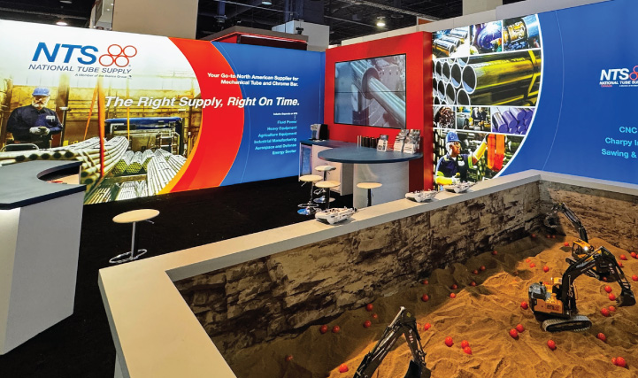
Digital Hive Mind, a Rockford based advertising and creative agency, recently completed a rebrand for National Tube Supply. Headquartered in University Park, IL, National Tube Supply is a global supplier of mechanical tubing to heavy industries including oil and gas, mining and large equipment manufacturing. The rebranding project included a new logo design, branded PowerPoint presentation, business cards, letterhead, envelopes, implementation across the company’s social media channels, as well as corporate messaging of vision and mission statements to facilitate alignment across the expansive organization.
What sets National Tube Supply apart from its competition is meticulous management of their expansive inventory and on-time delivery, which are key selling points for their customers. The branding was developed to have an industrial, rugged feel that would resonate with NTS’ customers and convey dependability and reliability. For the brand mark, the four rings represent the tubular products NTS sells as well as how they are stacked for storage and transportation. Looking forward as the brand matures, the rings will be able to be used as a standalone element in some instances. Utilizing a heavy bold italicized font helped create an easy identifier for trucks, hardhats and product IDs, which all play an important role for visibility of the brand. Orange was chosen to stand out amongst the reds and blues of their competitors, and the grayish brown represents the oxidation that occurs on steel. In the end we were able to create a brand that is unique to NTS and yet still fits within the branding of the global family of companies owned by their parent company.